_edited.png)
The Colours Behind the Apps
- Rosie
- Mar 25, 2024
- 1 min read
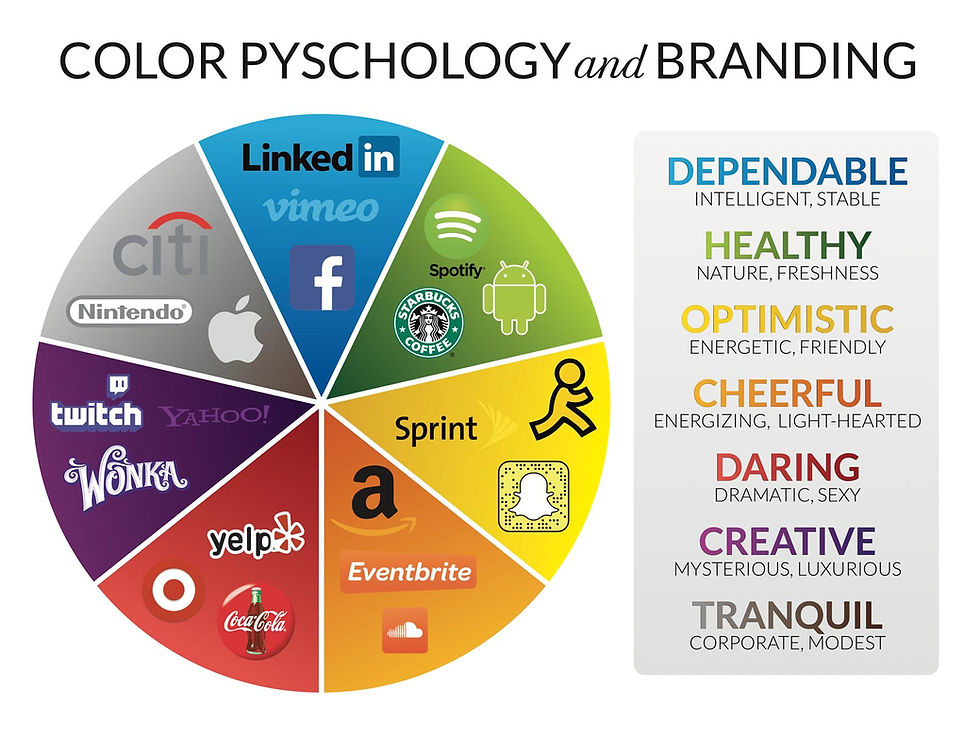
This may be surprising but, after functionality, colour is the most important element to any app design. Using the right colours can help the app to attract users whilst looking aesthetically pleasing to the eye. There is more to this than meets the eye however nad this is where science comes into it. Different colours release different chemicals in your brain causing different emotions and responses - for example social media apps like instagram and Snapchat use bright colours that potentially stimulate the release of endorphins. If you look around most social media apps do the same thing mainly using a colour palette of pink, red or strong contrasting colours like black, white, grey. Information apps that use a clean and balanced colour palette like: grey, green, white or different shades of blue are trying to crete a calmness of mind that makes them seem reliable.
Colour in apps serves various purposes: it can evoke and convey emotions, establish brand identity, enhance usability and guide user attention. Different colours evoke specific feelings (e.g., blue for calmness), and a well-chosen palette can create a visually appealing and user-friendly experience. Additionally, consistent use of colour helps users associate certain elements with specific functions, improving navigation and overall usability.
Furthermore, colour plays a crucial role in accessibility by aiding users with visual disabilities. High colour contrast enhances readability, making content more accessible. Consistent colour-coding can also assist in communicating information, such as highlighting important buttons or indicating status changes. Overall, thoughtful colour design contributes to the overall user experience, making apps more engaging, user-friendly, and inclusive.


Comments